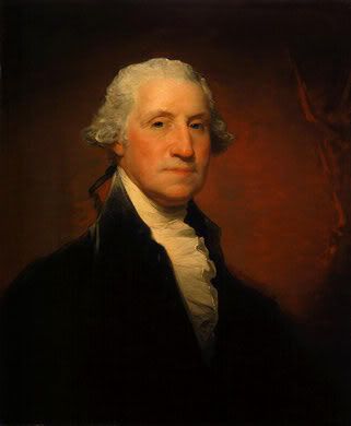
This essay will examine two pieces of artwork. Both of these pieces are portraits of their subject; however each artist chose a very different approach to their particular work. In 1795 Gilbert Stuart created “George Washington” with oil on canvas. This particular piece was from a series of portraits of President Washington painted by Stuart. One of the portraits from this series later became the portrait on the dollar bill. Stuart was a portrait painter. He painted rich and famous individuals in the late 1700’s into the beginning of the 19th century. This period, the 18th century, was known as the Rococo period. This was an extension of the baroque style. Rococo paintings are ornate but unlike baroque style works, they are more suited to private residences of the rich than in cathedrals (434-435). The culture at the time was one of revolution. Many of his subjects were important figures to the Revolution, including President Washington. Stuart’s style was very traditional. He paid close attention to detail and painted individuals to look as they would in life.
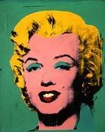
In 1962 Andy Warhol created “Green Marilyn” using a silkscreen on synthetic polymer paint on canvas. It was one of his famous mass productions. Andy Warhol created art during the modern period. After the end of World War II, Western art was on the rise. The center of the art world moved to New York City and gave rise to the New York School of art (536). This was a period of post war expressionism. Artists were free to try new things and be more creative. This is what led to Warhol embracing Pop Art in the 1960’s. Pop Art is short for “popular” and portrays everyday items and images, often like advertising and media (543). Andy Warhol would take images of everyday items like Campbell’s soup cans or famous people like Marilyn Monroe and show them as repeating images or in unusual colors. “Warhol’s style was cool and detached” (544), he claimed that his art was all on the surface and contained no deeper meaning. Because of this belief he would not comment on his pieces. He was surprised that people sought out a meaning behind his works, they were looking for social implications that he said he was not making. This essay will examine these two works by first discussing the subject matter, next the design, followed by the mood, the medium and techniques used, and finally the styles used by the artists.
The subject matter of these two pieces is similar because both artists created a portrait of a famous American; however, this is where the similarity ends. The theme of “Green Marilyn” is the Human Experience (69). It was created soon after the death of Marilyn Monroe. Warhol tended to paint objects that were currently en vogue with popular culture and Marilyn Monroe was very famous. The work was probably created to pay homage to her life at a time that the entire country and some of the world was mourning her death. Color plays an important role in this composition. As in “Green Marilyn”, I initially thought the theme for “George Washington” was the Human Experience, but after further thought, I believe the theme is Politics and Social Order (57). “George Washington” was created in 1795, four years before Washington’s death. He was President of the United States at the time of the painting which made him a popular subject. This painting shows him as a very distinguished individual, as fitting his public office. It is very dark and portrays the President as very stoic. This does not humanize him to the populace, but rather makes him appear unapproachable.
Design plays an important role in art. There are several similarities and differences in the designs of these two works. Contour lines, lines drawn to record boundaries (83), are used to set off Marilyn’s face. Warhol uses a well defined the line between the face and hair along the forehead making the hair look like a cap, not apart of the face. Stuart on the other hand does not use lines in his portrait of George Washington. He uses shading and implied light to make the subject stand out from the background. This actually makes Washington appear 3-dimensional on a 2-dimensional canvas. Warhol’s painting of Monroe however does not stand out from the background, he did not intend for her to appear 3-dimensional. In both portraits the face is a figure, a shape used to detach and focus on, and the ground, the surrounding visual information the figure stands out from (89), is plain making the face the focal point. The major design difference between these works is the use of color. Warhol uses mostly tertiary colors, mixtures of primary color and adjacent secondary colors on the color wheel (95). The colors are also very intense, pure colors not mixed with much grey (96). This combination makes color the most obvious aspect of the work. Stuart uses varying degrees of white and black and values of red. Values of color refer to relative lightness or darkness (96). Red was probably mixed with grey to come up with skin tone, cheeks and a small amount in the background to highlight the face. The reason red and grey were probably mixed is that artists may add a mixture of black and white paint, grey, to a color to lower the intensity allowing them to make various shades of the color (96). In this case various shades of red to highlight Washington’s face. Both of these portraits are asymmetric. Asymmetry in artwork is when both sides of the composition do not match (129). In this work, Washington is set slightly to the left and the right side of the painting is relatively empty which draws the focus again to the face. Like Stuart, Warhol focuses on the face of his subject by setting it slightly off center making the artwork asymmetrical. The artist’s use of lines, shapes, color, and asymmetry are just a few of the design elements used by Stuart and Warhol that make their portraits sometimes similar and often times different.
The moods of these two pieces are very different even though they both are portraits of their subjects. Stuart’s painting of Washington is very stoic and dark. It is also very true to life. He tried hard to make Washington appear as he would have during that time period of his life. President Washington was a serious man and the piece was created during a time of turmoil in the U.S. These two things play into the fact that Stuart painted this portrait in a serious manner. Warhol on the other hand used color to make Marilyn Monroe appear dramatic. He created a silkscreen from a famous picture of Monroe and then used various colors in his prints to make each reproduction somewhat different. This work was created soon after Monroe’s death so they act as a tribute to her life; the life of a famous actress who was outgoing and flamboyant in her public life.
Gilbert Stuart created “George Washington” using oil on canvas. Oil paints are created using pigment mixed with a medium, a liquid that holds the particles of pigment together, typically linseed oil (168, 172). These paints dry very slowly which allows artists to blend colors by layering. Andy Warhol however utilized synthetic polymer paint on canvas in 1962 when he created “Green Marilyn”. These paints are commonly known as acrylics and they gain popularity in the 1950s. Acrylics were the first paints that competed with the use of oil paints by western artists (180). They are more versatile than oil paints and they can be used in ways that mimic many differently types of paints and they can be used on various surfaces (180). Gilbert Stuart took advantage of the properties of oil paints when creating “George Washington”. The painting must have been created using layers of paint. This is evident when looking at the realistic colors of the subjects face. The shade of the skin varies to highlight his cheeks, nose and chin. He may have used glazes, thin, translucent veils of color applied over the thicker underpainting (175). This is evident by the flawless glowing finish of the painting. The strokes are not heavy in this work; the colors are well blended together which makes the painting appear very realistic to me. Andy Warhol used synthetic polymer paint on canvas to create his unique “Green Marilyn”. The paints were actually applied using a silkscreen. A silkscreen is a fine mesh of silk mounted in a frame, rather like a window screen. The artist then works from drawings to block out parts of the screen not meant to print by plugging up holes so that no ink passes through (203). A different screen is created for each color (204). This allowed him to make the same piece of art using many different color combinations. Even though both of these pieces were created using paints, their mediums were very different. “George Washington” was created using a traditional approach utilizing oil paints applied with a brush, while “Green Marilyn” uses a much less widespread approach, synthetic paints applied with a silkscreen, making them appear very different from each other.
Both Stuart and Warhol style’s are representational. This means that subjects are easily recognizable, however only Stuart portrayed his subjects in a naturalistic way, as they would in life (29). Warhol’s Marilyn was not naturalistic because of his use of color.
In conclusion, Stuart and Warhol both painted famous American’s, but they often differed in their approach. This paper briefly discussed the subject matter, design, mood, medium and technique, as well as the style of these two artists. Both Stuart and Warhol painted portraits that represented the individual but the employed color in ways that made them appear different. They also differed in their approach to design, Stuart did not use lines while Warhol did and Washington appeared 3-dimensional while Monroe did not. The mood in Stuart’s painting is very stoic and dignified while Warhol used color to make Monroe dramatic. The mediums used also made the artworks different. Both artists used paint; however one was oil based and the other acrylic. Also, Warhol did not use a paintbrush to create his work, he used a silkscreen. The styles were similar in that they represented their subject but Stuart’s was naturalistic in appearance. Finally, I chose these works initially because prior to taking this course I was not very familiar with fine art, I tended to gravitate to photographs. I thought by choosing portraits it would be similar subject matter to what I am used to seeing through photos. This course has opened my eyes to many of the elements that go into creating a work of art.
Monday, November 12, 2007
Wednesday, November 7, 2007
Activity #13
The appearance of art is often influenced by the time period in which it was created. Throughout history, artists style which is “a characteristic, or a number of characteristics, that we can identify as constant, recurring or coherent” (587), influences the appearance of their pieces. This essay will briefly touch on the style, movement and appearance of my two works from the online museum visit, “George Washington” and “Green Marilyn”.
In 1795 Gilbert Stuart painted “George Washington” utilizing oil on canvas. Stuart’s style is representational, meaning that it is easily recognizable (29). Further, his artwork is naturalistic meaning the items portrayed in the work appear as they would in life (29). Stuart was a portrait painter. He painted rich and famous individuals in the late 1700’s into the beginning of the 19th century. This is the period during and after the American Revolution. Many of his subjects were important figures to the Revolution, including President Washington. He paid close attention to detail and painted individuals to look as they would in life. The painting I chose in the online museum visit is one of a series created by Stuart of President Washington. This painting was so naturalistic in style that was chosen to be used on the one dollar bill.
Andy Warhol created “Green Marilyn” in 1962. It was one of his famous mass productions. In order to do this he used silkscreen on synthetic polymer paint on canvas. Warhol is the most famous pop artist. Pop art is the “fine art of commercial images” (544). He would take an image of a famous person or item, like Marilyn Monroe or Campbell’s soup cans, and repeat the image over and over and then mass reproduce the images. According to the text, “Warhol’s style was cool and detached” (545). He would not comment on his work, he did not indicate if the work had an underlying meaning or if he was commenting on society during the 60’s and 70’s. He simply indicated that the art was in what you saw, not in a deeper meaning. His work was representative of the items, as was Stuart’s portraits of his subjects. However, he would often use color to make the image unique and not exactly as it would appear naturally.
This essay briefly explored the style and appearance of Gilbert Stuart and Andy Warhol’s work. Both created works that were representative of life but they had very different styles. Stuart painted portraits that were meant to look exactly like the subject while Warhol took commercial subjects and repeated their images and mass produced them making them appear not as natural.
Wednesday, October 31, 2007
Activity #11 Periods and Cultures
Every piece of art is created during a period, a time period when artists use similar techniques to create their pieces. A period lasts at least one hundred years. Culture is also important when influencing art. This is a particular stage of society according to Webster’s Dictionary. This essay will briefly describe the period and culture that influenced Gilbert Stuart’s “George Washington”, oil on canvas painted in 1795 and Andy Warhol’s “Green Marilyn”, a silkscreen on synthetic polymer paint on canvas created in 1962.
Gilbert Stuart was one of the most famous American portrait painters during his lifetime. He painted many Presidents as well as other rich and famous people. His famous paintings of George Washington show the President as a stately figure and it was eventually used as the portrait on the dollar bill. This period, the 18th century, was known as the Rococo period. This was an extension of the baroque style. Rococo paintings are ornate but unlike baroque style works, they are more suited to private residences of the rich than in cathedrals (434-435). The culture at the time was one of revolution. The American Revolution allowed America to assert its independence and Stuart was painting the President’s and other important figures in American history at that time.
Andy Warhol like Stuart painted popular subjects for money. However, Warhol did not focus on Presidents and other power Americans, he focused on pop culture. After the end of World War II, Western art was on the rise. The center of the art world moved to New York City and gave rise to the New York School of art (536). This was a period of post war expressionism. Artists were free to try new things and be more creative. This is what led to Warhol embracing Pop Art in the 1960’s. Pop Art is short for “popular” and portrays everyday items and images, often like advertising and media (543). Andy Warhol would take images of everyday items like Campbell’s soup cans or famous people like Marilyn Monroe and show them as repeating images or in unusual colors.
Even though these two artists were working during different periods and in vastly different cultures, they were both famous American artists. They took famous Americans and images and made them into wonderful pieces of artwork.
Wednesday, October 24, 2007
Activity #10 - Mediums and Techniques
In 1795, Gilbert Stuart created “George Washington” using oil on canvas. Oil paints are created using pigment mixed with a medium, a liquid that holds the particles of pigment together, typically linseed oil (168, 172). These paints dry very slowly which allows artists to blend colors by layering. Andy Warhol however utilized synthetic polymer paint on canvas in 1962 when he created “Green Marilyn”. These paints are commonly known as acrylics and they gain popularity in the 1950s. Acrylics were the first paints that competed with the use of oil paints by western artists (180). They are more versatile than oil paints and they can be used in ways that mimic many differently types of paints and they can be used on various surfaces (180).
Gilbert Stuart took advantage of the properties of oil paints when creating “George Washington”. The painting must have been created using layers of paint. This is evident when looking at the realistic colors of the subjects face. The shade of the skin varies to highlight his cheeks, nose and chin. He may have used glazes, thin, translucent veils of color applied over the thicker underpainting (175). This is evident by the flawless glowing finish of the painting. The strokes are not heavy in this work; the colors are well blended together which makes the painting appear very realistic to me.
Andy Warhol used synthetic polymer paint on canvas to create his unique “Green Marilyn”. The paints were actually applied using a silkscreen. A silkscreen is a fine mesh of silk mounted in a frame, rather like a window screen. The artist then works from drawings to block out parts of the screen not meant to print by plugging up holes so that no ink passes through (203). A different screen is created for each color (204). This allowed him to make the same piece of art using many different color combinations.
Even though both of these pieces were created using paints, their mediums were very different. “George Washington” was created using a traditional approach utilizing oil paints applied with a brush, while “Green Marilyn” uses a much less widespread approach, synthetic paints applied with a silkscreen, making them appear very different from each other.
Tuesday, October 23, 2007
Critical Thinking Essay
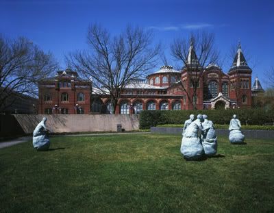
"The Last Conversation Piece" Bronze Sculpture by Juan Munoz (1994-1995)
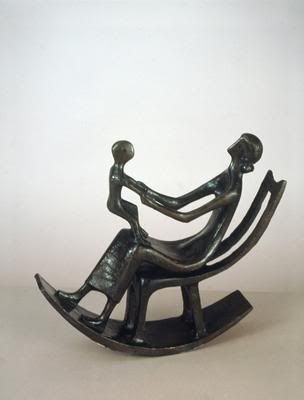
"Rocking Chair No. 2" Bronze Sculpture by Henry Moore (1950)
Should a meteorite strike the Hirshhorn Museum and Sculpture Garden in Washington, D.C. Chad Van Hoesen chose to save Henry Moore’s 1950 bronze sculpture, Rocking Chair No. 2 and Nancy Johnson selected a bronze sculpture created in 1994-95 by Juan Munoz entitled, The Last Conversation Piece. First, Nancy will discuss her piece and then Chad will address the reasons for saving his.
My first impression of The Last Conversation Piece was that five figures that make up the scene reminded me of the roly-poly Weeble figures that sat in the Fisher-Price airplanes and buses. No matter how often you knocked them down, they always got up. In case of a disaster, I would hope that we could do the same.
This grouping invites you to participate by eavesdropping on the conversation or perhaps quarrel among the three central figures which are grouped together. You sense an antagonistic atmosphere as though two of the figures are ganging up on the third. Munoz relays this information by the positioning of his figures. One figure has its arm extended into the chest of another. Another figure is leaning forward as if he is yelling at the same figure. There are two secondary figures located some distance from the central three figures. As one might expect during a playground quarrel or a street brawl, these two figures seem to be coming to their aid. It is unclear whether they are making their way across the field to join the fight or to de-escalate the tension, but it is clearly human to want to help.
While this piece would be logistically difficult to save, I think that Munoz’s grouping should be saved because it captures the human spirit. It represents the frustrating moments in our lives and our need to express our frustrations. The piece also reminds us that we are not alone. It is representative of how we deal with our conflicts, whether they international, domestic or simply personal.
Rocking Chair No. 2 is a sculpture in bronze created by Henry Moore in 1950. This piece celebrates the relationship between mother and child. The reason I choose to save this piece of artwork is because my wife just gave birth to our first child eight weeks ago today. I have been fascinated by the transformation in the both of us. We have gone from self-centered couple to Mom and Dad. We still catch ourselves marveling about the fact that we have a baby to take care of. When I look at this piece of artwork I see her rocking the baby during the night and after feeding time. It makes me pause to think about all those quiet moments that we get to spend with our new addition.
In this piece the mother and child are at play. The exaggerated curve of the chair and of the floor beneath her feet makes it look as if they are quickly rocking back and forth. The mother has her head thrown back which makes it look as if she’s laughing. I feel nothing but happiness and joy when looking at this piece. I believe that is how most parents feel when they are at play with their children. In this day and age many of us are so wrapped up in our careers that we do not take the chance to enjoy simple pleasures, like rocking our children. By saving this piece of artwork, I hope to show parents that there is joy to be found in our children.
Noticeably, each of us sees art as a powerful way to capture different aspects of human relationships. The pieces we selected to save represent the flaws and the beauty of being human.
Wednesday, October 17, 2007
Activity #9
The camera was invented in the 19th century and its use became more widespread during the industrial revolution. The use of the camera freed painters and sculptors from their traditional role of recording appearances and events (219). Pictures were now able to do this task. This essay will briefly explore some of the changes noted in artwork after the widespread use of the camera.
The use of the camera allowed artists to begin exploring the abstract and art that was not representative of real life. First, Monet led the impressionist movement. Monet used short brush strokes and painted directly onto the canvas, without sketching first. These brush strokes caused the paint to have a texture and not be smooth as was the fashion prior to photography. This also allowed him to delve into the design elements of color and light. The subject of the artwork did not necessarily take over the piece anymore, but the design allowed for the artist to make observations and it gave them a more free hand.
Next, post impressionism and expressionism came into vogue. These artworks made the elements of design even more important than during the impressionist movement. Van Gough was an artist during this period. He explored the use of color in his pieces and they no longer reflected reality.
Finally, cubism became popular. Cubism allowed artists to explore multiple perspectives in their work, a technique that could not be done using photography at the time.
The advent of the camera and its widespread use allowed artists the freedom to express what they saw in their minds eye, and not necessarily what is actually there to be seen. It allowed for design principles such as the use of color, light, and symmetry to be explored. This made art, in my opinion, more interesting.
Tuesday, October 9, 2007
Midterm--Nature, A Theme in Art
The following exhibition highlights six paintings that span history beginning in the early 1600’s throughout the early 1900’s. The theme of these works is nature. These pieces were chosen because they all highlight water in their landscape. Each artist has a unique perspective on how water is depicted in their work. When nature is portrayed through art it allows the audience to see the world through the eyes of the artist. Nature is sometimes portrayed literally and sometimes in the abstract, meaning it is interpreted through the eyes of the artist. This exhibition will explore the theme of nature in these six works by reviewing some of the design elements and principles that were utilized by the artist to highlight their theme, nature.
Jan Brueghel the Elder
River Landscape, 1607
Oil on Copper
National Gallery of Art, Washington, DC
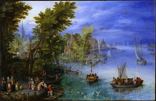
In 1607, Jan Brueghel the Elder used oil on copper to create “River Landscape”. The light (90) in this work is shown coming through the dark sky in the upper left corner. This is evident through the break in the clouds and the light shining on the water in the front right of the painting. The area in front of the light is shown in detail with the area behind are shown as if in a fog. This painting is also very asymmetrical (129). The weight of the work is on the left side and the right side of the work is much less busy and painted in lighter colors.
Richard Parkes Bonington
The Grand Canal, 1826/1827
Oil on Canvas
National Gallery of Art, Washington, DC
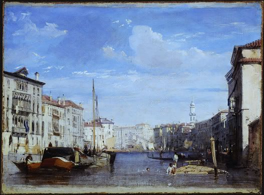
“The Grand Canal” is an oil on canvas piece created in 1826/1827 by Richard Parkes Bonington. He utilized several visual and design elements to create this beautiful scene. The first is atmospheric perspective (113). This is a technique that is “based on the observation that distant objects appear less distinct, paler, and bluer than nearby objects due to the way moisture and the intervening atmosphere scatters light”. In this painting the buildings in the back of the work take on a light blue tint from the sky making them appear far away in the distance. Light (90) is another element utilized by the artist. In this work, the buildings on the right side of the painting are shaded on the front because the light in the painting is shining from high in the sky on the right. This is also obvious because the buildings on the left are bathed in light. Scale (136) is evident in this work because the buildings start out large at the front of the painting and as the view looks toward the back of the canal the buildings get smaller. Scale is the size in relation to normal size. The use of scale draws the viewers’ attention down the canal.
Auguste Renoir
The Blue River, c. 1890/1900
Oil on Canvas
National Gallery of Art, Washington, DC
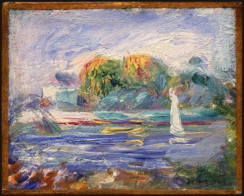
“The Blue River” was created with oil on canvas around 1890-1900 by Auguste Renoir. When first looking at this piece, the eye is drawn to the statute in the water. Renoir emphasized (134) this statue by painting it pure white. This is the only pure white in the work. He also used an open palette. A palette describes the range of colors used in a work and an open palette is one in which all colors are permitted (98, 586). This work utilizes yellow, red, blue, and green as well as various shades and tints of them. The work is also a-symmetrical (129). This is evident because the right side of the work contains most of the visual weight. Visual weight refers to the apparent “heaviness” or “lightness” of the forms arranged in a composition, as gauged by how insistently they draw the viewers’ eyes (125). The viewers’ eyes are drawn to the statue on the right side of this work.
Claude Monet
The Japanese Footbridge, 1899
Oil on Canvas
National Gallery of Art, Washington, DC
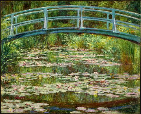
Claude Monet created “The Japanese Footbridge” in 1899 with oil on canvas. Color is a major element of this work. First, the colors used in this work, shades of green, yellow, blue and red, are analogous colors (97). These are a combination of colors adjacent to one another on the color wheel. The viewer sees these colors throughout the work. Monet also used color to highlight the focal point (134) of the work. A focal point is created when one area of a work is emphasized. It is easy to see the bridge is the focal point because of the use of the color blue. This is the only place in the work where blue is utilized. The water is not even blue, it is used to reflect the grasses and the colors in them. Finally, the grasses, bridge, and water are all painted in the same portions as they would be in reality, meaning the scale (136) is the same as one would see in nature.
Maurice de Vlaminck
Tugboat on the Seine, Chatou, 1906
Oil on Canvas
National Gallery of Art, Washington, DC
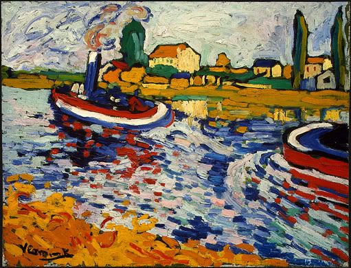
In 1906, Maurice de Valminck created “Tugboat on the Seine, Chatou” utilizing oil on canvas. He used primary colors (red, yellow and blue), as well as secondary colors (orange and green) to create this work (95). By using all these colors it is apparent that he was using an open palette like Renoir did when creating this piece. Movement (84) is created in this work by the heavy brush strokes and their direction in the water. The water is portrayed running around the front of the second boat which shows that the boats are moving upstream from the way the water is running.
John Marin
Middle of Atlantic, 1909
Watercolor on Wove Paper
National Gallery of Art, Washington, DC
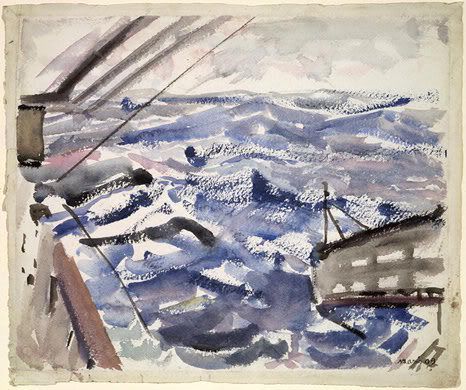
John Marin used watercolor on wove paper in 1909 to create “Middle of the Atlantic”. This piece is created solely with black and blue paint. These are cool colors (95). This color choice makes the work appear melancholy. The sky is grey and the water is dark blue and black and painted to make the water appear choppy. The view might assume that there is a storm brewing in this painting. Marin used a restricted palette (98), which is the use of few colors in a work. He only uses the two colors and then he mixes them to get various tints of blue, black and grey.
Jan Brueghel the Elder
River Landscape, 1607
Oil on Copper
National Gallery of Art, Washington, DC
In 1607, Jan Brueghel the Elder used oil on copper to create “River Landscape”. The light (90) in this work is shown coming through the dark sky in the upper left corner. This is evident through the break in the clouds and the light shining on the water in the front right of the painting. The area in front of the light is shown in detail with the area behind are shown as if in a fog. This painting is also very asymmetrical (129). The weight of the work is on the left side and the right side of the work is much less busy and painted in lighter colors.
Richard Parkes Bonington
The Grand Canal, 1826/1827
Oil on Canvas
National Gallery of Art, Washington, DC
“The Grand Canal” is an oil on canvas piece created in 1826/1827 by Richard Parkes Bonington. He utilized several visual and design elements to create this beautiful scene. The first is atmospheric perspective (113). This is a technique that is “based on the observation that distant objects appear less distinct, paler, and bluer than nearby objects due to the way moisture and the intervening atmosphere scatters light”. In this painting the buildings in the back of the work take on a light blue tint from the sky making them appear far away in the distance. Light (90) is another element utilized by the artist. In this work, the buildings on the right side of the painting are shaded on the front because the light in the painting is shining from high in the sky on the right. This is also obvious because the buildings on the left are bathed in light. Scale (136) is evident in this work because the buildings start out large at the front of the painting and as the view looks toward the back of the canal the buildings get smaller. Scale is the size in relation to normal size. The use of scale draws the viewers’ attention down the canal.
Auguste Renoir
The Blue River, c. 1890/1900
Oil on Canvas
National Gallery of Art, Washington, DC
“The Blue River” was created with oil on canvas around 1890-1900 by Auguste Renoir. When first looking at this piece, the eye is drawn to the statute in the water. Renoir emphasized (134) this statue by painting it pure white. This is the only pure white in the work. He also used an open palette. A palette describes the range of colors used in a work and an open palette is one in which all colors are permitted (98, 586). This work utilizes yellow, red, blue, and green as well as various shades and tints of them. The work is also a-symmetrical (129). This is evident because the right side of the work contains most of the visual weight. Visual weight refers to the apparent “heaviness” or “lightness” of the forms arranged in a composition, as gauged by how insistently they draw the viewers’ eyes (125). The viewers’ eyes are drawn to the statue on the right side of this work.
Claude Monet
The Japanese Footbridge, 1899
Oil on Canvas
National Gallery of Art, Washington, DC
Claude Monet created “The Japanese Footbridge” in 1899 with oil on canvas. Color is a major element of this work. First, the colors used in this work, shades of green, yellow, blue and red, are analogous colors (97). These are a combination of colors adjacent to one another on the color wheel. The viewer sees these colors throughout the work. Monet also used color to highlight the focal point (134) of the work. A focal point is created when one area of a work is emphasized. It is easy to see the bridge is the focal point because of the use of the color blue. This is the only place in the work where blue is utilized. The water is not even blue, it is used to reflect the grasses and the colors in them. Finally, the grasses, bridge, and water are all painted in the same portions as they would be in reality, meaning the scale (136) is the same as one would see in nature.
Maurice de Vlaminck
Tugboat on the Seine, Chatou, 1906
Oil on Canvas
National Gallery of Art, Washington, DC
In 1906, Maurice de Valminck created “Tugboat on the Seine, Chatou” utilizing oil on canvas. He used primary colors (red, yellow and blue), as well as secondary colors (orange and green) to create this work (95). By using all these colors it is apparent that he was using an open palette like Renoir did when creating this piece. Movement (84) is created in this work by the heavy brush strokes and their direction in the water. The water is portrayed running around the front of the second boat which shows that the boats are moving upstream from the way the water is running.
John Marin
Middle of Atlantic, 1909
Watercolor on Wove Paper
National Gallery of Art, Washington, DC
John Marin used watercolor on wove paper in 1909 to create “Middle of the Atlantic”. This piece is created solely with black and blue paint. These are cool colors (95). This color choice makes the work appear melancholy. The sky is grey and the water is dark blue and black and painted to make the water appear choppy. The view might assume that there is a storm brewing in this painting. Marin used a restricted palette (98), which is the use of few colors in a work. He only uses the two colors and then he mixes them to get various tints of blue, black and grey.
Wednesday, October 3, 2007
Activity #5
Artwork is created for a reason, and the reason that an artist chooses to do a particular work will tie to a theme. These themes vary from secular, to political, human experience, and historic to name a few. This essay will discuss the themes utilized by Andy Warhol when he created “Green Marilyn” a silkscreen on synthetic polymer paint on canvas in 1962, and by Gilbert Stuart in 1795 when he created “George Washington” using oil on canvas.
The theme of “Green Marilyn” is the Human Experience (69). It was created soon after the death of Marilyn Monroe. Warhol tended to paint objects that were currently en vogue with popular culture and Marilyn Monroe was very famous. The work was probably created to pay homage to her life at a time that the entire country and some of the world was mourning her death. Color plays an important role in this composition. Warhol uses complementary colors in this artwork to highlight Monroe’s features. The background for this work is a shade of green while her lips are red. These two colors are complementary, harmonies involving colors directly opposite one another on the color wheel (97). Also, her hair is very pure yellow which makes it very intense (96). The use of intense, complementary colors helps to place emphasis (134) to the beautiful features that make up Marilyn Monroe’s face.
I initially thought the theme for “George Washington” was the Human Experience, but after further thought, I think the theme is Politics and Social Order (57). “George Washington” was created in 1795, four years before the death of the President. He was President of the United States at the time of the painting which made him a popular subject. This painting shows him as a very distinguished individual, as fitting his public office. It is very dark and portrays the President as very stoic. This does not humanize him to the populace, but rather makes him appear unapproachable. Color is used to emphasis his face. The vast majority of the work is made using black, but his face is emphasized by the use of hues (96) of red. This also lightens up the work around the face which draws the viewer’s attention. The artist also highlights the President’s face with the use of implied lines (86). Stuart uses shading to make these implied lines, the further from the face, the more the lines and background blur together. The expression on the face is very stoic, this again plays into the theme of Politics and Social Order, because it makes Washington appear Presidential and not common.
Monday, October 1, 2007
Wednesday, September 26, 2007
Activity #4
Gilbert Stuart painted “George Washington” in 1795 utilizing oil on canvas. In order to create this composition he utilized emphasis and subordination, asymmetry and proportion.
Emphasis is used to draw the viewer’s attention to certain aspects of the work, while subordination is used to make other parts of the composition less appealing so as not to take the viewer’s attention away (134). These techniques highlight Washington’s face. The painting is very dark so the artist uses light colors on and around the face to highlight it. Asymmetry in artwork is when both sides of the composition do not match (129). In this work, Washington is set slightly to the left and the right side of the painting is relatively empty which draws the focus again to the face. Proportion in a composition refers to the size of the parts in relation to what is considered normal (137). In this artwork, the body of Washington appears much larger than the head again drawing attention to the face.
In 1962, Andy Warhol created “Green Marilyn” with silkscreen on synthetic polymer paint on canvas. Like Stuart he uses asymmetry and color to emphasize the subject’s face; however he also uses variety and rhythm.
Like Stuart, Warhol focuses on the face of his subject by setting it slightly off center making the artwork asymmetrical. The use of color does two things in this work. It is used to emphasize the features of the face, he makes the lips bright red, the eyelids teal and the hair bright yellow. Each of these colors is set off with the use of shadows which draws the viewer’s attention. The use of color also adds variety, difference that provides interest (122). The colors in this artwork are very bold and they contrast which makes the colors a distraction from the actual face from the subject. The various colors actually make the features appear to stand alone and not as part of a whole. Finally, Warhol uses rhythm, or repetition (141). He uses the same color in the background and for the eyes which draws the two colors together.
In conclusion, both works are portraits that focus on the subject’s face, however the design principles are used differently which is evident through the differences in the works.
Wednesday, September 19, 2007
Assignment #2
“Green Marilyn” by Andy Warhol in 1962 and “George Washington” by Gilbert Stuart in 1795 are both portraits of famous Americans. The first is a silkscreen on synthetic polymer paint on canvas and the second is oil on canvas.
Contour lines, lines drawn to record boundaries (83), are used to set off their subject’s faces. Warhol uses a well defined the line between the face and hair along the forehead making the hair look like a cap, not apart of the face. Stuart uses blurred lines to outline the entire portrait from the background.
Both artists utilize chiaroscuro, Italian for light/dark (92). Warhol uses it to show the lighting coming from the upper left by showing shadows under the eyelashes, and below the chin. Washington’s face is lit from the front right, as if with a spotlight, made obvious with shadows.
In both portraits the face is a figure, a shape used to detach and focus on, and the ground, the surrounding visual information the figure stands out from (89), is plain. This makes the face the focal point.
The major difference between these works is the use of color. Warhol uses mostly tertiary colors, mixtures of primary color and adjacent secondary colors on the color wheel (95). The colors are also very intense, pure colors not mixed with much grey (96). This combination makes color the most obvious aspect of the work. Stuart uses varying degrees of white and black and values of red. Values of color refer to relative lightness or darkness (96). Red is mixed with grey to come up with skin tone, cheeks and a small amount in the background to highlight the face.
Saturday, September 15, 2007
Assignment #1 ART 101 On-Line Museum Visit
George Washington by Gilbert Stewart 1795 Oil on Canvas
Green Marilyn by Andy Warhol 1962 Silkscreen on Synthetic Polymer Paint on Canvas
Green Marilyn by Andy Warhol 1962 Silkscreen on Synthetic Polymer Paint on Canvas
Creative Notebook
What are the two main balances the text in Chapter 5 describes? The two main balances are Symmetry and Asymmetry.
Symmetry: "Propeller Heads" a photograph of a sculpture by David Baker 2004
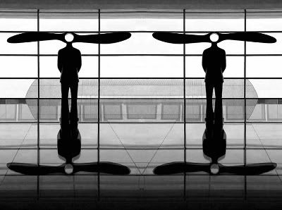
According to the text, Symmetrical balance is the implied center of gravity is the vertical axis, an imaginary line drawn down the center of the composition (125). In this photograph, the image is the same on either side of the center making it symmetrical. I also find it interesting due to the reflection on the sculptures in the floor.
Asymmetry: "Mobile" a sculpture by Alexander Calder 1948
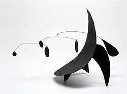
According to the text, an asymmetrical composition has two sides that do not match (129). This sculpture is very heavy on the right with only small objects on the left that do not balance it out, thus making it asymmetrical.
Chapter 3 discusses Themes in Art. The following are three works of art I enjoy that show three of the themes.
The first is the Sacred Realm (52)
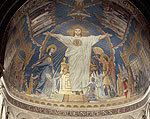
Themes in the Sacred Realm depict faith. I choose the mosaic of Christ in Majesty that is on the ceiling at the Basilica at Sacre-Couer. It was created from 1920-1922. I have not been able to find the artist however. When my wife and I went to Paris last year, this mosaic really stood out to me. It was huge and very impressive. The tiles used to make the mosaic also glitered in the sunlight making it even more beautiful.
The next example deals with Politics and the Social Order (57)
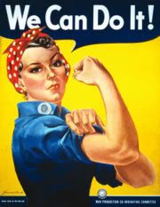
Artworks dealing with Politics and Social Order can often depict the ideals of a society at a given point in time. I chose this poster of Rosie the Riveter created by J. Howard Miller during WWII. It represented women in the workforce during the War and it was used as a way to encourage women to leave the home and work in the factories while the men went off to war.
The last example I will show is from Looking Inward: The Human Experience (69)
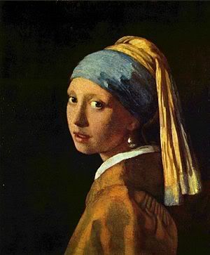
This theme depicts lives of people, hopes, dreams, and wishes that may be different or similar depending on that person's circumstances. I chose Girl with a Pearl Earring by Johannes Vermer, oil on canvas painted from 1665-1675. I saw the movie (forced by my wife) by the same name and it brought this painting to life for me. The face in the painting really stands out and contains such emotion. She seems surprised that someone would want to paint her and she also appears nervous at the same time.
Dada Art
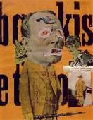
According to the text, Dada was "an international art movement that emerged during WWI (1914-1918). (583)" The works are intentionally shocking or provocative in order to spur conversations. This piece is a photomontage and collage created in 1919 by Raoul Hausmann.
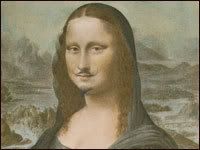
This next Dada piece is by Marcel Duchamp. He took a reproduction of the "Mona Lisa" and drew a mustach on it as a statement against art that has become to commercial.
The following are various types of paintings:
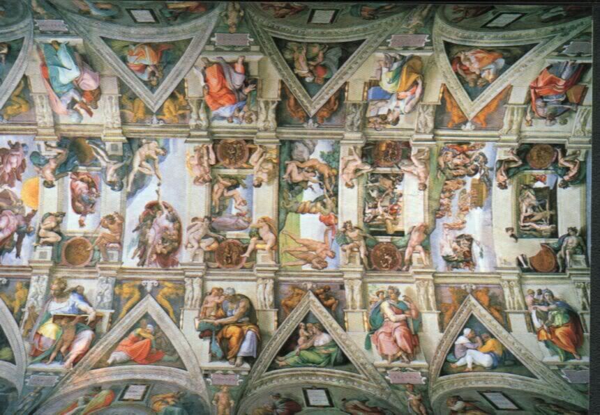
Fresco
Fresco Art is art is created when pigments are mixd with water and applied to a plaster support like a ceiling (169). Michelangelo painted the ceiling of the Sistne Chapel from 1508-1512.
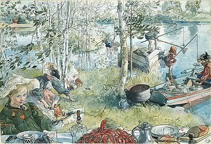
Watercolor
"Watercolor consists of pigment in a vehicle of water and gum arabic, a sticky plant substance that acts as teh binder." (177)
The following is a watercolor created by Carl Larsson in 1897. It is titled "Crayfishing".
Acrylic
Acrylic paints were the first major challenger to oil paints. They were created in the 20th century by chemists (179). They were first made commercially available in the 1950's. They dried much more quickly than oil paints making them very popular.
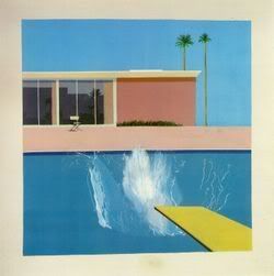
The following was created by David Hockney in 1967 with acrylic paint on canvas.
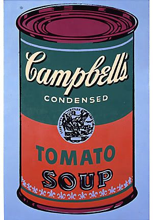
Another famous acrylic painting is Andy Warhol's "Campbell Soup" created in 1965 using acrylic on canvas.
These next two works are Photographs. Photography got it's start in 1826 and has changed art since it's inception. Photography allowed artists more freedom as they were no longer the only people able to capture things has they occurred.
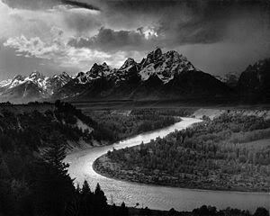
This photo was taken by Ansel Adams in 1942. It is called "The Tetons and the Snake River"
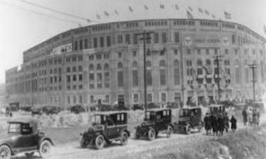
This photo was taken of Yankee Stadium on April 18, 1923 when it opened. I do not know the photographer but I love this pictures. I'm obviously a HUGE Yankee fan.
The following paintings are from the Impressionist period. My wife loves these paintings and always makes me spend time looking at them when we are in museums. These both are from the National Gallery of Art.
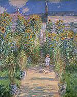
The first is "The Artist's Garden at Vétheuil" by Claude Monet with oil on canvas in 1880.
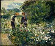
The second is "Picking Flowers" by Auguste Renoir in 1875 utilizing oil on canvas.
The next work is from the romantic period. According to the text this was "not a style so much as a set of attitudes and characteristic subjects" (507). It urged the use of imagination.
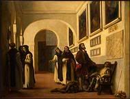
"Christopher Columbus and His Son at La Rábida" was created using oil on canvas in 1838 by Eugène Delacroix
I like Representational Art because the subject is obvious. I like art that does not take a lot of dissection. Here are two works one that is representational and one that is abstract.
Representational:
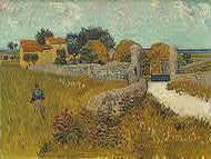
"Farmhouse in Provence" oil on canvas by Vincent Van Gogh in 1888.
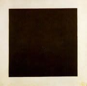
Abstract:
"Black Square" by Kazimir Malevich in 1915 with paint (one of four created).
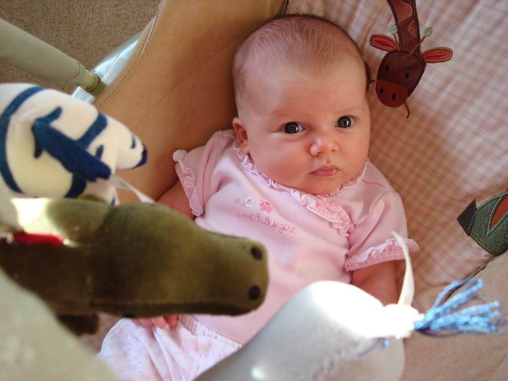
This last piece is a photograph, yes I know it's personal but I had to throw one picture in of my new daughter. She's my personal work of art...
Symmetry: "Propeller Heads" a photograph of a sculpture by David Baker 2004
According to the text, Symmetrical balance is the implied center of gravity is the vertical axis, an imaginary line drawn down the center of the composition (125). In this photograph, the image is the same on either side of the center making it symmetrical. I also find it interesting due to the reflection on the sculptures in the floor.
Asymmetry: "Mobile" a sculpture by Alexander Calder 1948
According to the text, an asymmetrical composition has two sides that do not match (129). This sculpture is very heavy on the right with only small objects on the left that do not balance it out, thus making it asymmetrical.
Chapter 3 discusses Themes in Art. The following are three works of art I enjoy that show three of the themes.
The first is the Sacred Realm (52)
Themes in the Sacred Realm depict faith. I choose the mosaic of Christ in Majesty that is on the ceiling at the Basilica at Sacre-Couer. It was created from 1920-1922. I have not been able to find the artist however. When my wife and I went to Paris last year, this mosaic really stood out to me. It was huge and very impressive. The tiles used to make the mosaic also glitered in the sunlight making it even more beautiful.
The next example deals with Politics and the Social Order (57)
Artworks dealing with Politics and Social Order can often depict the ideals of a society at a given point in time. I chose this poster of Rosie the Riveter created by J. Howard Miller during WWII. It represented women in the workforce during the War and it was used as a way to encourage women to leave the home and work in the factories while the men went off to war.
The last example I will show is from Looking Inward: The Human Experience (69)
This theme depicts lives of people, hopes, dreams, and wishes that may be different or similar depending on that person's circumstances. I chose Girl with a Pearl Earring by Johannes Vermer, oil on canvas painted from 1665-1675. I saw the movie (forced by my wife) by the same name and it brought this painting to life for me. The face in the painting really stands out and contains such emotion. She seems surprised that someone would want to paint her and she also appears nervous at the same time.
Dada Art
According to the text, Dada was "an international art movement that emerged during WWI (1914-1918). (583)" The works are intentionally shocking or provocative in order to spur conversations. This piece is a photomontage and collage created in 1919 by Raoul Hausmann.
This next Dada piece is by Marcel Duchamp. He took a reproduction of the "Mona Lisa" and drew a mustach on it as a statement against art that has become to commercial.
The following are various types of paintings:
Fresco
Fresco Art is art is created when pigments are mixd with water and applied to a plaster support like a ceiling (169). Michelangelo painted the ceiling of the Sistne Chapel from 1508-1512.
Watercolor
"Watercolor consists of pigment in a vehicle of water and gum arabic, a sticky plant substance that acts as teh binder." (177)
The following is a watercolor created by Carl Larsson in 1897. It is titled "Crayfishing".
Acrylic
Acrylic paints were the first major challenger to oil paints. They were created in the 20th century by chemists (179). They were first made commercially available in the 1950's. They dried much more quickly than oil paints making them very popular.
The following was created by David Hockney in 1967 with acrylic paint on canvas.
Another famous acrylic painting is Andy Warhol's "Campbell Soup" created in 1965 using acrylic on canvas.
These next two works are Photographs. Photography got it's start in 1826 and has changed art since it's inception. Photography allowed artists more freedom as they were no longer the only people able to capture things has they occurred.
This photo was taken by Ansel Adams in 1942. It is called "The Tetons and the Snake River"
This photo was taken of Yankee Stadium on April 18, 1923 when it opened. I do not know the photographer but I love this pictures. I'm obviously a HUGE Yankee fan.
The following paintings are from the Impressionist period. My wife loves these paintings and always makes me spend time looking at them when we are in museums. These both are from the National Gallery of Art.
The first is "The Artist's Garden at Vétheuil" by Claude Monet with oil on canvas in 1880.
The second is "Picking Flowers" by Auguste Renoir in 1875 utilizing oil on canvas.
The next work is from the romantic period. According to the text this was "not a style so much as a set of attitudes and characteristic subjects" (507). It urged the use of imagination.
"Christopher Columbus and His Son at La Rábida" was created using oil on canvas in 1838 by Eugène Delacroix
I like Representational Art because the subject is obvious. I like art that does not take a lot of dissection. Here are two works one that is representational and one that is abstract.
Representational:
"Farmhouse in Provence" oil on canvas by Vincent Van Gogh in 1888.
Abstract:
"Black Square" by Kazimir Malevich in 1915 with paint (one of four created).
This last piece is a photograph, yes I know it's personal but I had to throw one picture in of my new daughter. She's my personal work of art...
Subscribe to:
Posts (Atom)